Data visualizations
CSE512 at UW and other projects
During the spring quarter at UW, I took Jeffrey Heer’s data visualization class. As part of this class, I worked on three assignments and a final project of which I would like to share the first two assignments.
In the first assignment we had to design a visualization for Burtin’s antibiotics dataset. The task was to design a visualization without any knowledge from the class. Here is what I created:
I created the static visualization with D3. The code is on GitHub.
For the second assignment, we could choose between different datasets to visualize. I chose the FAA flight data and wanted to answer the question whether airlines overestimate the flight times in order to avoid having bad on-time records. TL;DR, the answer is yes.
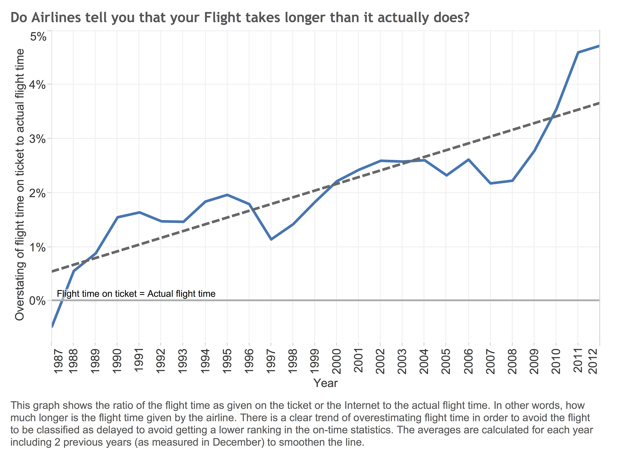
The data in this plot is based on 1.4GB of flight records for one month each year since 1987. I created the plot with Tableau.
Not as part of the class but during the Open Data Day, I worked on a live map of bus locations in Seattle.